Bancra: All your banking rewards in one place
Improving the UI of a financial rewards mobile app in a 10-day design sprint.
Introduction
Bancra is a financial lifestyle app that connects users to bank-sponsored offers while helping them stay on track, make progress and redeem real rewards.
Bancra at a glance
Problem
What often happens with financial tech services is the organizational hurdles users have to go through to manage multiple accounts via multiple banks and redeem multiple rewards. The existing Bancra app was not solving this very core issue.
The main pain point was clarifying Bancra’s “missions” as the main offers by respective banks while adding hierarchy and timelines. In addition, clarifying how users could move from completing missions to purchasing consumers goods directly in the app’s Marketplace experience.
Not a great sign when users don’t know how to navigate the main experience of the app.
Solution
The addition of a refined “mission” or bank offers section became the highlight of the redesign. Alongside a series of visual tweaks here and there, including much-needed centralized banking, white space to ease the eye, and a clear marketplace, in order to make the app more approachable to newcomers.
See Figma Prototype here


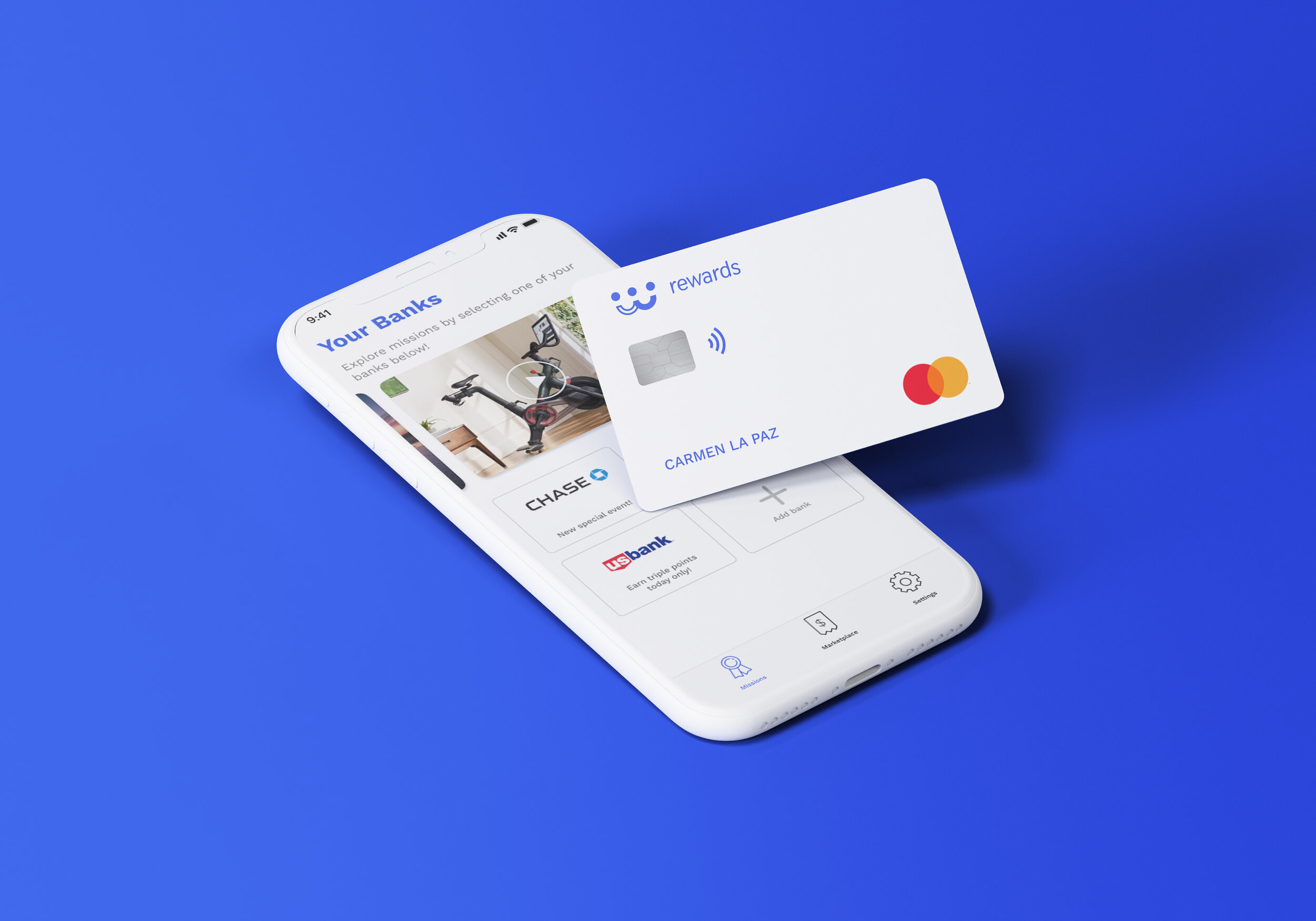
New sign-up, main banks page and redesigned screens
Logistics
Team
1 Product Lead
1 Product Designer
2 Developers / Founders
Timeframe
November, 2020
My role
UI Research
Wireframing
Visual Design
Brand Refresh
Design Process
This redesign was completed in less than 10 days in a team of two while working under the guidance of a product design lead Darren Davis. We focused our main efforts on the UX/UI redesign by prioritizing the deliverables for the design hand-off and keeping in mind the banking stakeholders’ requirements. Through the design sprint, our design lead had constant communication with the CEOs and Developers, Eric Schneider, and Ryan Tomczik to ensure we were building on Bancra’s vision for success.

Research
We began by looking at fin-tech competitors' applications that would link external bank accounts, and use rewards systems as well as how they would incorporate any marketplace experiences to ultimately redeem offers.
I wrote down my own observations of popular applications using a think-out-loud method, picturing what we could incorporate to refine the experience while learning from other competitors. I also conducted a small internal heuristics evaluation to get informed about best practices around financial services.

Observe
Once we gathered all the results from our research, we paired them with the stakeholder notes received from direct input from the developers and CEOs of Bancra. Similarly, we mapped common themes and suggestions from the stakeholder’s perspective to guide what designs to focus on for this refresh. In the end, a design audit was key to best identify the limitations of the existing design while providing a more refined experience.

Design
Taking our insights of possible improvements generated from our research and design exercises, we then began to build different high-fidelity designs to understand the best ways of refinement. As we developed the various screens, our Product Lead made sure to sync daily with founders and CEO to get immediate feedback to ensure alignment of expectations and deliverables.
There were a handful of necessary segments to focus on:
Insert a section for users to identify their banks without linking their accounts first
Design the missions home experience to help users know who they are banking with
Create a clear mission per bank, where users can toggle and prioritize offers by length and time
Create a uniform design systems that would help users navigate the app seamlessly while focusing on the content offered

Branding
After designing, we ended up creating a basic look and feel refresh for this part of the project, which was aimed to elevate the Bancra brand and provide consistency through the experience. Unfortunately, we didn’t expand towards a larger design system due to the time it would take to integrate a full brand into the project.

Existing Bancra on the App Store
Proposed designs for the App Store

Proof of concept for the Branding Implementation
MVP
With the designs, framework, and branding decided upon, it was time to combine them into one cohesive unit. We continued refining our prototypes and hacked together some of our different ideas, wired them up using Figma, and were ready to share this prototype with the founders and banking stakeholders.


Conclusion
From this project, I gained a lot of insights into the inherent complexities of building financial services and the benefits of connecting a user’s multiple bank accounts to centralize information, access rewards, and redeem them all in one place.
I got to develop designs iteratively and quickly, alongside prototyping with the engineer hand-off in mind. Implementing UI red lines and an 8-point grid system became key for design development.
Connecting directly with developers and Founders during the design process made a huge difference. We utilized the design sprint method from Jake Knapp’s Sprint and made sure we were communicating with the right stakeholders to ensure alignment of expectations and deliverables.
We expect our redesign brings clarity and focus to the user experience, and that newcomers feel a sense of easiness when adding their multiple banking information and seeing the benefits in a transparent way.
What I would do moving forward?
When looking at “Missions” it would be of importance to understand how to differentiate them between Daily, Weekly, and Monthly. Is it solely based on expiration times, or are there other factors to consider?
There should be a tab to “save” missions for later so users can review their preliminary choices and ultimately enroll.
There should be an emphasis on the overall design system to improve the usability and understanding of earned points, missions already claimed, and the cost of new missions.
There should be ongoing communication with banking stakeholders to understand their marketing and promotion requirements to best present their missions through the Bancra experience.
Insert tabs of “learn more” in specific core features to further explain what the CTA (Call to Action) is all about or what the label means.